
Share
4th August 2017
09:22am BST

 https://twitter.com/VodafoneIreland/status/893380994388168705
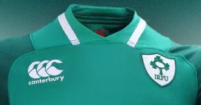
There are two shades of green on the kit, with the sleeves and shoulders slightly darker.
The collar looks great, with white accents on either side of a V-neck design.
https://twitter.com/Elverys/status/893381006643875840
The jersey is available in stores from today onwards.
Here is some of the manufacturing spiel:
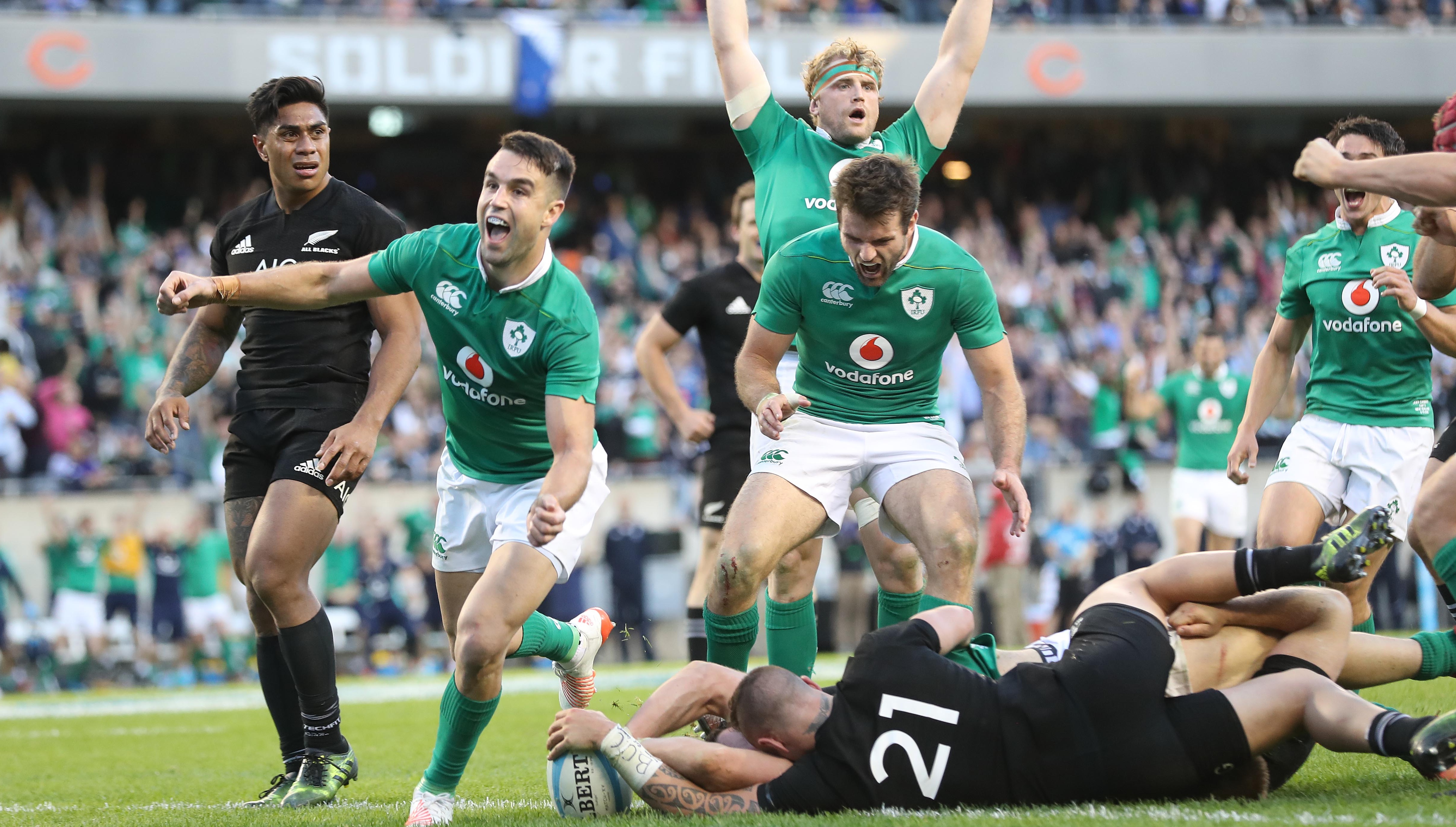
'Inspired by each of the four provinces’ highest peaks, the jersey’s insignia acts as visual distraction, designed to mask movement and allow players to slip through the tackle. 'Player comfort and tackle avoidance have been enhanced with the inclusion of flatlock seams, triple needle stitching, increased sleeve mobility and a double layered loop neckline.'So that's why we didn't win the Six Nations - lack of sleeve mobility. We feel it is the best Ireland home kit in years and is an improvement on the 2016/17 kit that will always be associated with beating the All Blacks in Chicago. That didn't look half bad though...
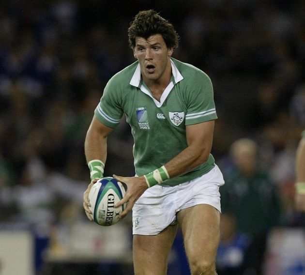
 It's no 2003 effort...
 ... but it is streets ahead of this number from 1995:
 Let us know what you think of the kit.