


Rugby
Share
Published 16:49 11 Nov 2015 GMT
Explore more on these topics:
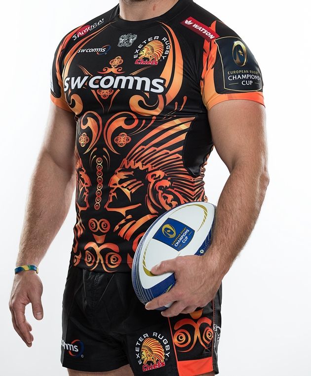 A monstrosity. Looks like a Maori-tribute botch job but is actually two Indian chiefs going face to face. Far too busy. Hard to find a positive.
 You're in the Champions Cup lads, make a bloody effort. Boring maroon number with a sponsor's logo hanging around the gut.
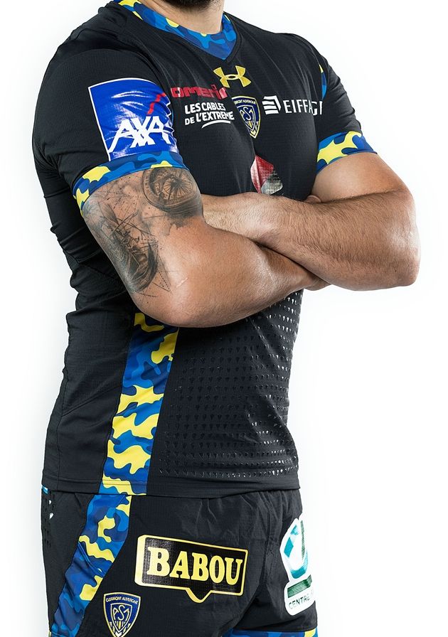 The perennial challengers have a nifty yellow number too but this is the kit they proudly displayed at the tournament launch. Blue and yellow army fatigue accents? No.
 Its digestive biscuitness is similar in so many ways to the Bordeaux boys. Plain and forgettable with a sad-looking collar.
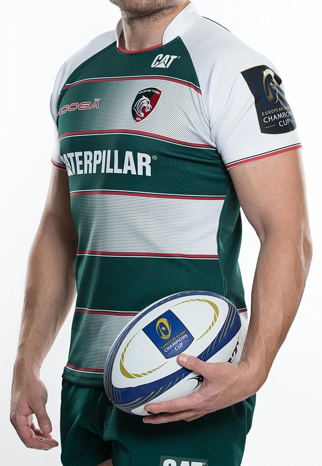 This will go down well at Welford Road but inspires little interest away from its cosy confines. Another upturned half collar.
 Some mathematics under both armpits to keep you busy on long away days. One of the only sides to sport the polo top-esque collar.
 Sticky bits on the chest to make balls easy to hold onto. The alternate kit will dice it out with the easier on the eye blue and white home number. A little too plain.
 More sticky bits and a gigantic sponsors' logo. Sponsors on the nifty, round collar too. Not bad.
 As brave this year as it was upon its launch last year. Far from perfect but fair play to Canterbury for having a dart. Bold to splash yellow across the midriff. Clean placement of logos and sponsor with a decent collar.
 The Welsh side have somehow, by the skin of Alun Wyn Jones' teeth, pulled off a daring Ospreys mask design in their jersey. Another change kit here but with some day-glo lemon to set off the black.
 Big collars are out this year and Ulster follow the trend. A lot of white going on with some flecks of red and black.
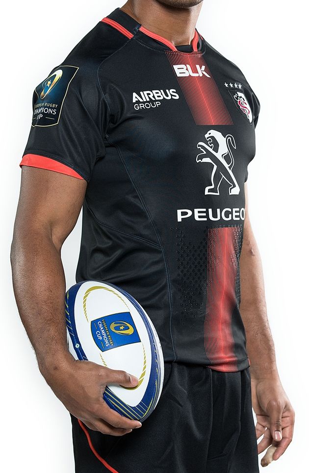
 Not one of Toulon's finest efforts but, given their strong colours, they rarely get it wrong. Crest is somewhat lost in the centre of the jersey and logos.
 The Parisians are more often 'miss' than 'hit' but they pull it off well this time. Pink lightning forks on an intricately designed navy jersey. Dipping collar is a bit naff.
 Black and yellow looking well with a bold drain down the chest and what looks to be loose tyre chippings across the whole jersey. Understated sponsor.
 Trumps the Toulon effort by reversing the colours and being bolder with the fade out. Would go well with casual wear.
 Not messing too much with the classic and keeping the long-time sponsor happy. You'll know who you are playing when he get a gape at this.
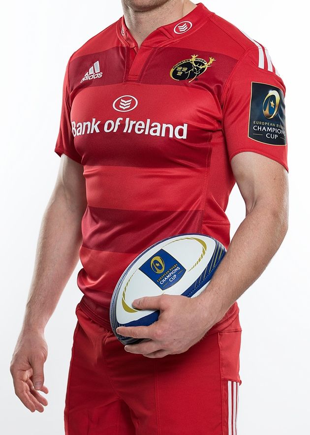 Much like the Toulouse effort. Simple but appealing. Classic Munster. The new home jersey would have ranked higher if the province did not have this special edition.
 A high finish for the Italians with this excellent light blue and white design. Well offset by the crest and logo. All ties in very well.
 Racing rarely go wrong, despite the splatter of sponsors. Best collar of the lot with nice accents. Dan Carter will look well in this.
 Well done you brave French battlers. The drops of colour somehow don't look amiss.
Rugby

Rugby

Rugby

Rugby
Ireland head coach strongly hints that James Lowe will be back in Ireland
Some light at the end of the tunnel…. Despite having a lot left to give, James Lowe has unfortunately been lost to Irish rugby, after contract negotiations between, himself, Leinster and the IRFU broke down. The New Zealand-born winger is on his way to Tokyo’s Suntory Sungoliath to take part in the Japanese Top League, […]
Rugby
1 day ago
Connacht the big winners as Andy Farrell names Ireland summer tour squad
A strong selection! Head coach Andy Farrell has named his 36-man Ireland squad for their upcoming summer tour, with matches against Australia, Japan and New Zealand. As expected, it is a strong selection with few surprises. However, given injuries to key players, there are three new faces and a handful of more inexperienced men. Caelan […]
Rugby
2 weeks ago

Rugby
Bernard Jackman reveals why James Lowe will expose reasons for contract farce
Rugby


