
Share
5th December 2015
03:30pm GMT

 It was a bit of a fans favourite with it's black and crimson stripes on the sleeves and the torso making it stand out on the pitch.
https://twitter.com/orlab744/status/630164538361544705
So if you are going to change something that works, we normally hope for an improvement. But sadly in our mind at least, the 2016 strip is very very unimaginative
https://twitter.com/kildare_fans/status/672898250689654785
It's a very plain white effort that has divided opinion among Kildare GAA fans
https://twitter.com/conorjimmykelly/status/672873370078355456?ref_src=twsrc%5Etfw
https://twitter.com/pcsportandpromo/status/672852312931610624
https://twitter.com/crikekenny/status/672856559156903936
But other fans liked the new very plain design
https://twitter.com/cilldaratimes/status/672926198855540736
https://twitter.com/dean_carthy97/status/673134521873793024
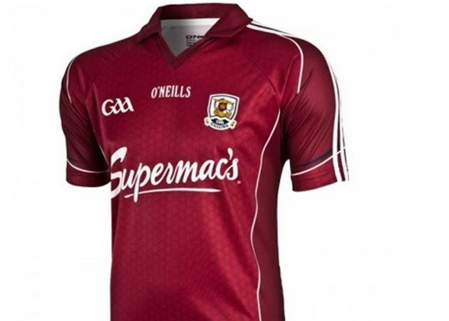
Elsewhere Galway also launched a new jersey last night and the major change is to the collar from the 2015 version.
 The 2016 incarnation has dispensed with the collar and instead is a streamlined version with what looks like pinstripes down the middle
https://twitter.com/TribesmenGAA/status/672877809665208321
And much like it's Kildare counterpart, fashion really is a matter of taste
https://twitter.com/KatelynNicAoidh/status/672897285894877184
https://twitter.com/Fiona1503/status/672883887702466561
The 2016 incarnation has dispensed with the collar and instead is a streamlined version with what looks like pinstripes down the middle
https://twitter.com/TribesmenGAA/status/672877809665208321
And much like it's Kildare counterpart, fashion really is a matter of taste
https://twitter.com/KatelynNicAoidh/status/672897285894877184
https://twitter.com/Fiona1503/status/672883887702466561Explore more on these topics: