

Share
2nd August 2017
02:30pm BST

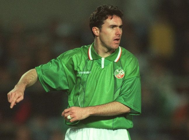 Talk about a World Cup hangover. This is just a kit with delusions of grandeur.
18. 2002
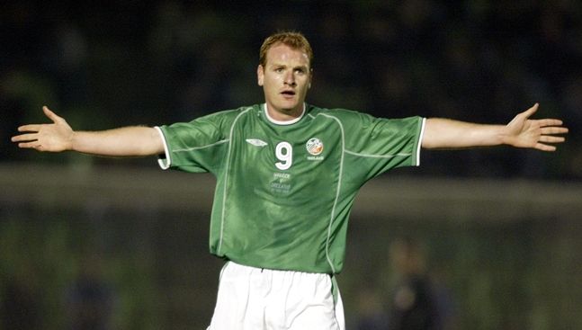 Good memories but the Japan/Korea kit was unshapely, unsightly and, call us dramatic, unforgivable.
17. 2003
 This is what happens when a jersey gets ideas above its station. Took a gamble with the hoops lining through it and it did not pay off.
16. 1998
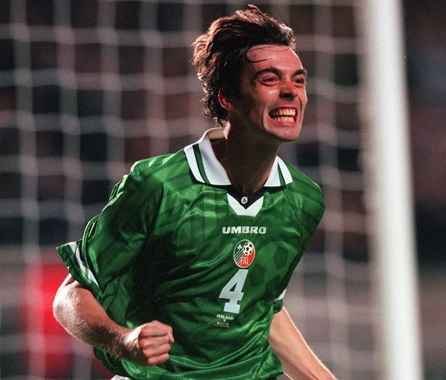 The nineties loved a good design within the jersey but hindsight doesn't love it so much. Weird collar and neckline with this effort. Gary Breen though.
15. 2010
 Must try harder. The shade of green isn't pleasant and the neck design and fit just smacks of laziness. We expect more from our jerseys.
14. 1996
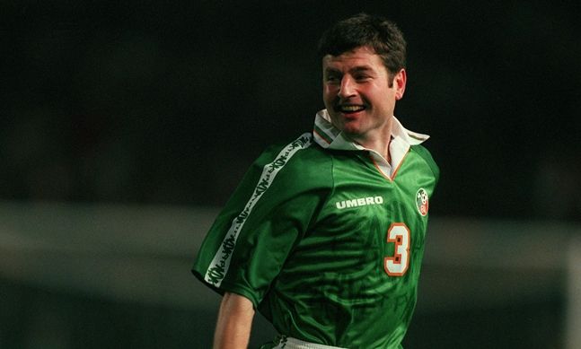 The retro collar actually looks pretty decent and the orange trim around this knitwear gives it a certain níl a fhios agam. Tries something strange with the arms. Not disastrous. Certainly not great.
13. 2000
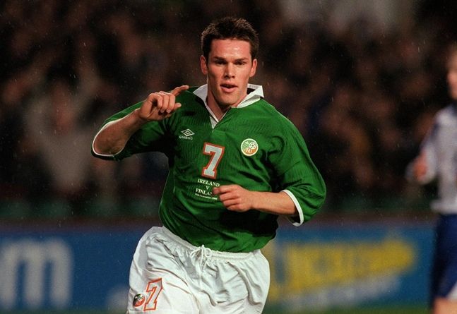 As retro numbers go, this is as old-fashioned as they come. Decent collar, nice buttoned neck line and a lovely cotton feel to boost. A wildcard.
12. 2012
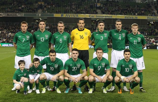 Simple, elegant. Let down in the collar area. And it's not even the right green.
11. 2017
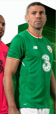 Much better than the leaked images of it. But Jon Walters would do that to a kit, wouldn't he?
10. 1994
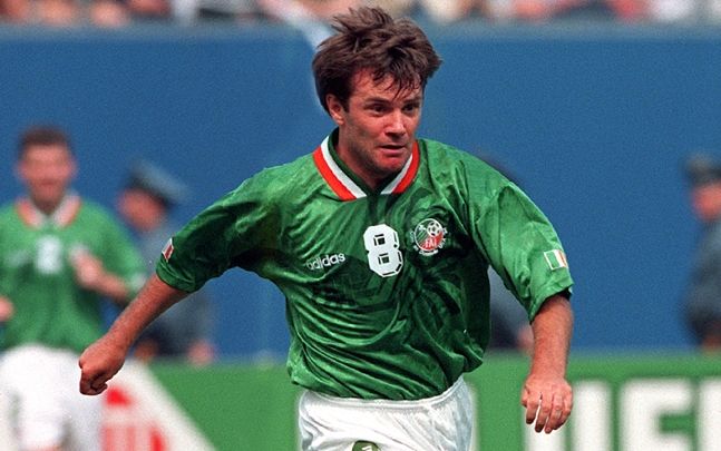 There's certainly been none like it.
9. 2004
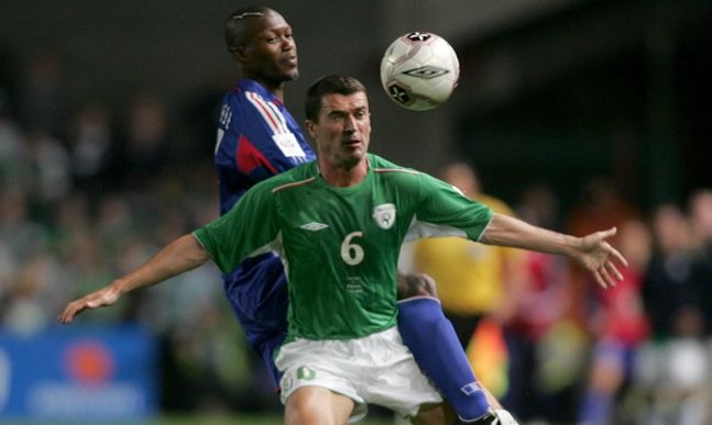 Just the right amount of everything but not enough of something. This is a good jersey. It's not a great one.
8. 2014
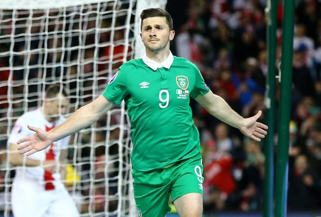 Perhaps this jersey wasn't appreciated in its own time as much as it should've been when it was released at an all-time-low in Irish football. It not only has good memories with it now but its collar is beautiful and it is simplicity
 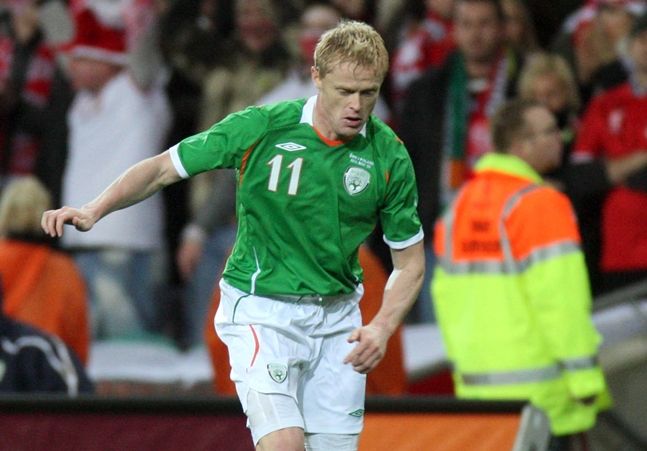 Fantastic colour, the right amount of orange and white with the right shade of green. The neck is on the money, the sleeves are a gem. Number one contender on its day but it is downright competitive at this point.
6. 1990
 Nice striped sleeves, nice simple premise. Looks like they got bored half-way through though and just threw the rest together.
5. 2006
 This is everything the 2012 jersey wanted to be. This is a dream. You'd be afraid to touch it design-wise in case you ruined any of it - thank God Umbro didn't. Some things are best left alone.
4. 2016
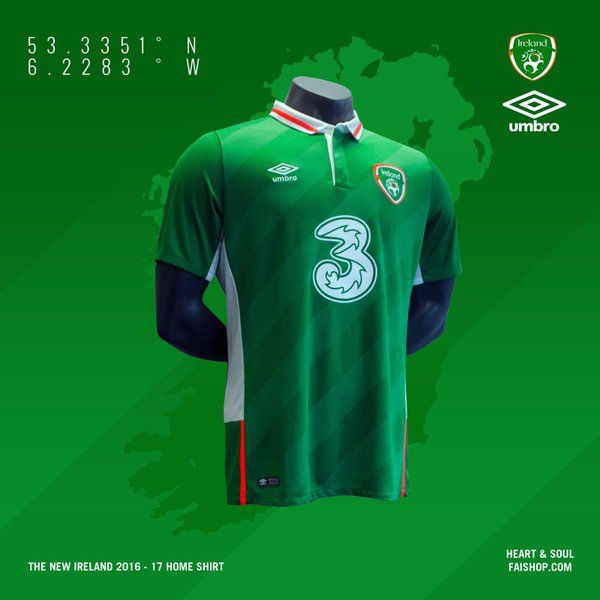 The white, the orange - perfect. The collar - perfect. The colour - perfect. And even room for a risk too with the subtle stripes running diagonally through it - and they're perfect. Combining simplicity with a bit of edginess.
3. 1988
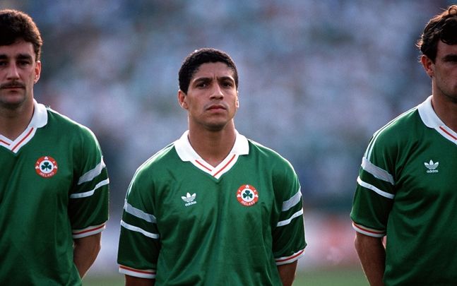 An example here of when risk-taking pays dividends. The stripes on the sleeves are daring and working. The original adidas logo with the old Ireland crest is a joy to behold. Just enough orange with the only drawback being the v-neck and collar combo. Make your mind up, like.
2. 1992
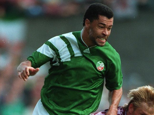 An iconic jersey because of its fearlessness. Great neck, fine brand placing and a good plain number - for the most part. Bold stripe design over the arm/shoulders/chest.
1. 1986
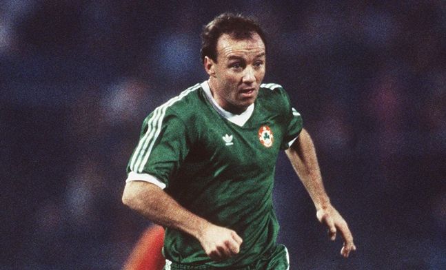 Sometimes the obvious answer is the right answer. This is simple. This is easy. This is oh so wonderful. V-neck, stripes, sleeve-trim, simple. Timeless.
Explore more on these topics: