We’ve already seen this week how risks taken when designing an international jersey can result in an absolute beauty.
Only a few days ago, we were left salivating over the pay-off that came from the re-imagination of Croatia’s kit design via Nike.
PICS: Croatia's risky Euro 2016 kits paid off in a big way https://t.co/hU3FEzw8ab
— SportsJOE (@SportsJOEdotie) March 16, 2016
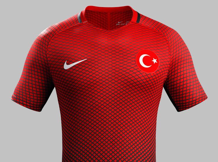
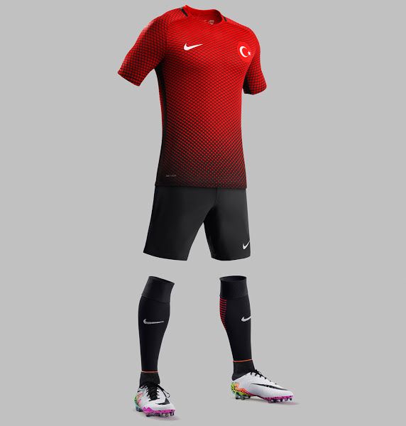
Croatia’s Group D rivals Turkey, too, tried to take a punt with their strips ahead of this summer’s Euro 2016 but, unfortunately, their gamble wasn’t quite as successful.
We’d be lying if we told you that we’d fallen in love with the strips that will be sported by Arda Turan & Co. in June as we just don’t get what they were going for.
The Turkish home kit has a bizarrely busy, mesh-pattern jersey with plain, bold shorts which is a juxtaposition that doesn’t lend itself to aesthetic beauty.
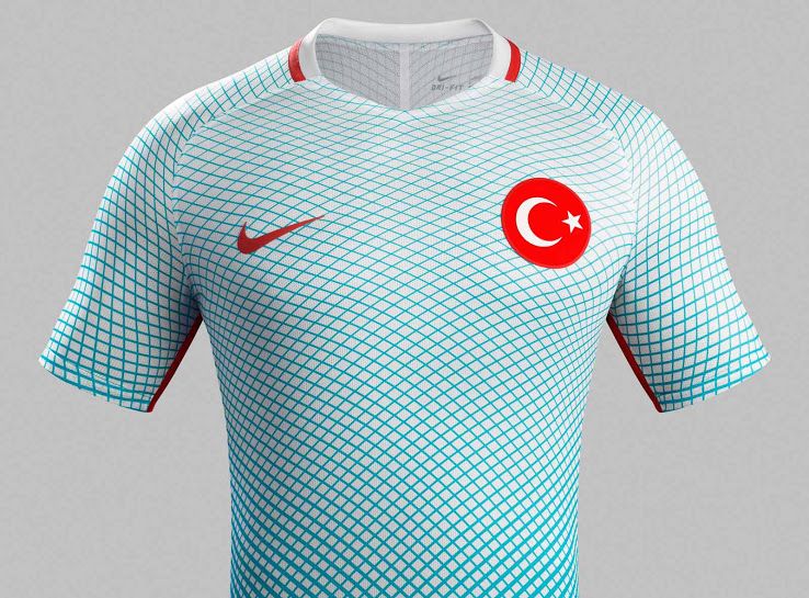
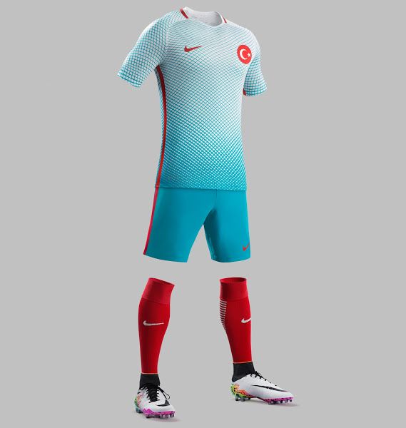
We must admit that the away strip is slightly more appealing with a light blue colour and a fade between jersey and shorts that is a bit smoother than the home kit.
But again, the red socks are too bold to match the jersey and shorts combination? We just don’t get it.

