
Share
9th April 2015
11:05am BST

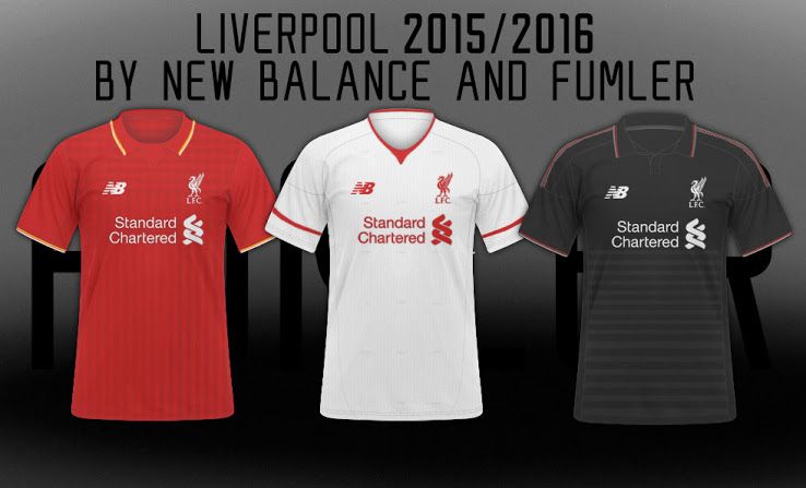
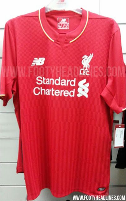
 The home kit brings back the yellow trim that we haven't seen on a Liverpool top in quite some time while the yellow away kit that the players currently tog out in will be done away with, with the white away jersey making a return to our shelves. We've also been shown more then just mock-ups for the home jersey, with this prototype looking pretty impressive.
 The second jersey has a similar enough pattern on the body of the jersey - albeit the stripes and chequered design are a bit thicker.
The collar, though, looks dodgy. It all looks a bit 1970s and compared to the more refined jersey above, it looks pretty cheap.
Still though, considering it's a photo of a hard copy of the jersey rather than just designs, it has to be taken seriously.
 The third, and probably least likely candidate is in my opinion the prettiest.
Simple, classy, and appealing to the eight-year-old in me because it's apparently EXPLODING, it looks by a mile to be the prettiest of the three.
However, all we have is a picture of the design, rather than one of the jersey itself, and when we floated the idea of this to Liverpool fans a few weeks back, many seemed to think it was fake.
Still, I just had to include it, similar to how a game show host shows a contestant what they could have won after they make a hames of their final question.
 Anyway, all shall be revealed tomorrow afternoon at around 1.30. Tick tock!
Explore more on these topics: