
Share
24th July 2016
11:53am BST

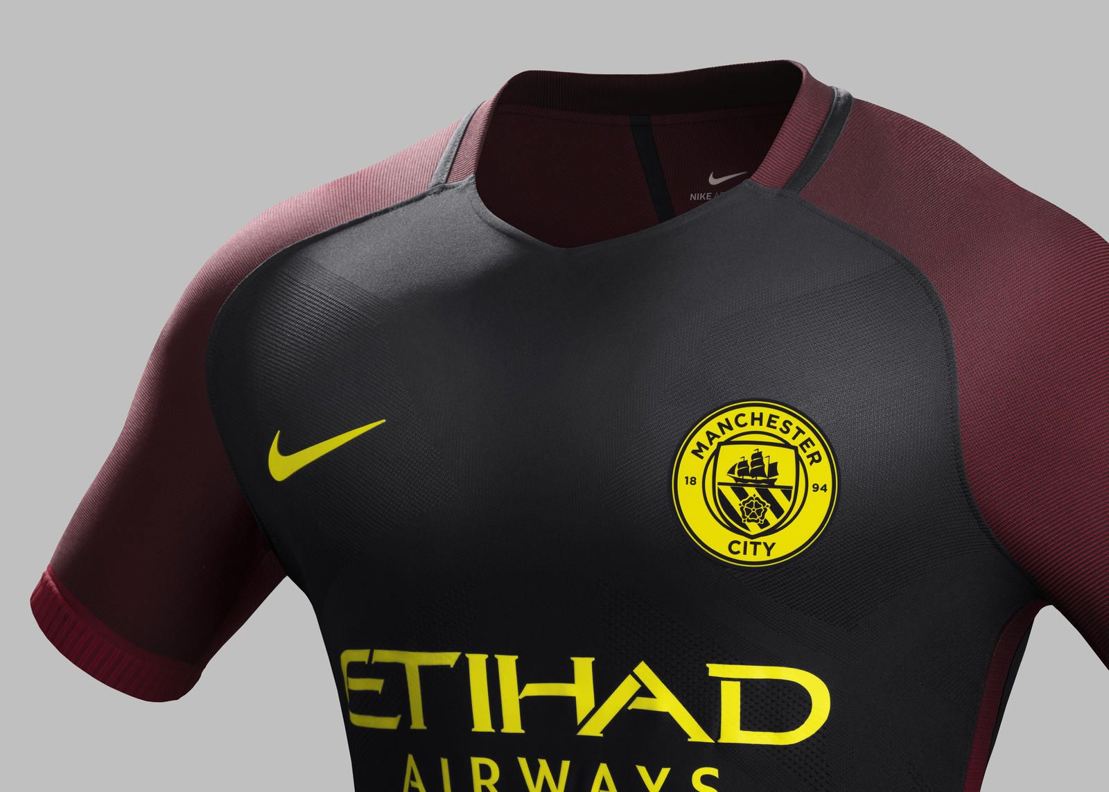
 The kit, which goes on sale from August 4 on the Nike website, is predominantly black with red details on the shoulders, down the sides and on the shorts along with flashes of yellow.
 Even the club's new crest has been given another new look in the yellow and black of Manchester's emblematic 19th Century worker bee. Because history.
 Some fans bloody loved the new away strip.
https://twitter.com/sachinks1/status/757135502176845824
https://twitter.com/xemilyalice_/status/757137414724915200
https://twitter.com/AhsanNaeem/status/757137655410913280
https://twitter.com/TimmyAkinyemi/status/757142418693222400
https://twitter.com/EduNgeru/status/757140400020815872
Others weren't quite as dazzled.
https://twitter.com/jasesidlow17/status/757135486175576064
https://twitter.com/flash_robamy/status/757136232195428352
https://twitter.com/dannypeacock98/status/757136365758869504
https://twitter.com/BD_IbraCadabra/status/757136895621074944
https://twitter.com/MarcoSalvaggio_/status/757145171620495360
https://twitter.com/Urban_Genie/status/757143032911192065
Explore more on these topics: